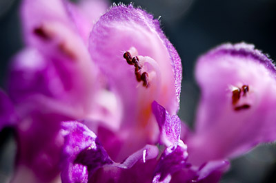
I’ve been posting images to my photoblog for over a year now, I’ve so far managed to have a new shot every day for 479 straight days. Now, I’m not bragging and saying look at what a great guy I am because I would consider only a handful of them all that great. But, my point is I’ve been doing this for awhile now and I learned something today that I wish I knew 479 images ago.
I’m guessing that most of you probably already know what I learned today and are probably going to say, duh! But there may be some of you for whom, like me, bright lights and singing from heaven was heard when I came across it.
Before I get to the great revelation, let me start with some background. I’ve long known that my images just don’t look the same in Photoshop as they do on the web. The pop and the color just don’t match what I see when I work on shots and when I post them. I just figured it was some color calibration thing of my monitor or something I was doing wrong or something that only the truly gifted and wise like David from Chromasia knew.
I searched Google and kept running into monitor calibration tutorials and other such advice that never worked. I even played a bit with color profiles in Photoshop, but that didn’t seem to help either.
Then I watched a video tutorial on Radiant Vista and found the magic ingredient I needed. The video is called “Sizing images for the web.” And they walk you through the steps that you should take when saving images for viewing on the web. One of the steps is to convert your image’s color profile from Adobe RGB to sRGB by going to edit/convert to profile. I had done this but never saw a difference in the image from within Photoshop, so went back to Adobe RGB and figured I was cursed with this problem forever. Why did i never convert the color profile and upload the picture I’ll never know. I’m a computer guy and I do programming and network administration and computer trouble shooting so my mind is generally programmed to work through problems by process of elimination but the process broke down here for some reason. Consider these two pictures: (the difference is harder to notice at this small size. Check out this page for larger versions.)
The difference between the two seems small, but to me who worked with the image to get it where I wanted, it’s huge. This difference has been a thorn in my side for some time, sitting there nagging me and irritating me.
Hopefully this helps someone like myself who’s fought with this issue for sometime. If I had money I would give generous amounts of it to the Radiant Vista crew or if I didn’t already have children I’d offer my first-born or something. Maybe some day when I get rich and famous I’ll look them up!
Update: I found a place to make donations on Radiant Vista’s website and made a small donation. I encourage you to make a donation also since their content is so valuable and useful. Every little bit helps with the costs of bandwidth and such.
Out of curiosity, how many of you already knew this?


